Have you ever walked into a store and felt happy right away? Or sat in a waiting room that felt calm and quiet? Chances are, the paint colors on the walls had a lot to do with that. Colors are powerful. They change how people feel, think, and act. And when it comes to your business, the right colors can make a huge difference.
At JT Paint & Design, we help businesses choose the best colors for their spaces. Whether you run a retail store, an office, a restaurant, or a warehouse, a smart commercial painting plan can help your business grow. This guide will walk you through everything you need to know about picking the right colors for your commercial space.
Why Color Matters in Your Business
Colors do more than make walls look nice. They send a message to everyone who walks through your door. That message can say “trust us,” “come in and relax,” or “get excited and buy something.” The right message brings in more customers and keeps them coming back.
First Impressions Happen Fast
Studies show that people form a first impression in just a few seconds. The colors in your space are part of that impression. A fresh, well-chosen commercial painting job tells customers that your business is professional and cares about details. A faded or wrong-colored space can push people away before they even look at your products.
Think of your walls as your business’s outfit. Just like you dress for success, your space should too.
Colors Affect How Customers Feel
Warm colors like red and orange create excitement. They make people feel energized and ready to act. That’s why many fast-food restaurants use these colors — they want customers to feel hungry and make quick decisions.
Cool colors like blue and green have the opposite effect. They calm people down and make them feel safe. Banks, clinics, and spas often use these colors because they want customers to feel relaxed and trusting.
Colors Help Employees Work Better
Your team spends hours in your space every day. The colors around them affect how they feel and how well they work. Bright, lively colors can boost energy and spark creativity. Too many bright colors, though, can cause distraction. The right balance keeps your staff focused, happy, and productive.
The Basics of Color Psychology
Color psychology is the study of how colors affect human feelings and behavior. When planning your commercial painting project, understanding these basics helps you make smart choices.
Red: Energy and Urgency
Red is bold and powerful. It grabs attention fast and creates a sense of urgency. Businesses use red to encourage quick decisions and fast action. Think of clearance sales, fast-food chains, and entertainment venues. Red works best as an accent color rather than a full wall color. Too much red can feel overwhelming or stressful.
Blue: Trust and Calm
Blue is one of the most popular colors in commercial painting. It communicates trust, stability, and calm. Banks, law firms, and tech companies love blue because it makes customers feel safe and confident. Light blue works well on walls to create an open, airy feel. Dark blue adds depth and authority.
Green: Health and Growth
Green connects people to nature. It feels fresh, healthy, and full of life. Businesses focused on wellness, organic products, or sustainability often choose green. It is also great for reducing eye strain, making it a smart choice for offices where people stare at screens all day.
Yellow: Happiness and Attention
Yellow is bright and cheerful. It lifts moods and draws the eye. Use yellow in small doses to add energy and warmth to a space. Too much yellow, however, can cause irritability. Yellow works well as an accent color in lobbies, waiting areas, or creative workspaces.
Orange: Creativity and Warmth
Orange blends the energy of red with the happiness of yellow. It feels friendly, creative, and warm. Orange is great for casual cafes, creative studios, and social spaces. It encourages conversation and connection. Like red, use it in moderation to avoid overwhelming the senses.
Purple: Luxury and Calm
Purple feels sophisticated and a little mysterious. Dark purples suggest luxury and elegance. Light purples, like lavender, feel soft and calming. Beauty salons, spas, and upscale boutiques often use purple to signal quality and care. Use purple as an accent rather than a primary wall color for the best effect.
Neutral Colors: Balance and Versatility
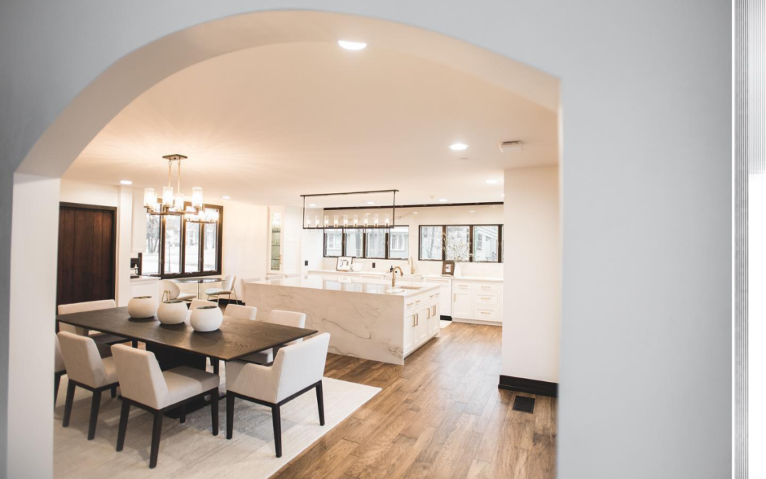
Neutrals like gray, beige, white, and taupe are the workhorses of commercial painting. They create a clean, balanced backdrop that lets your products, art, or branding stand out. Neutrals are timeless and professional. They pair well with almost any other color. Many modern offices, retail stores, and healthcare facilities rely on neutrals for a polished look.
Black and White: Contrast and Clarity
Black and white create strong visual impact. White makes spaces feel bigger, brighter, and cleaner. Black adds drama, depth, and sophistication. High-end brands often use black and white to signal luxury and precision. Use white on walls to open up small spaces and black on trims or accents for a bold, modern look.
Best Colors for Retail Stores
Retail stores want customers to feel excited, comfortable, and ready to buy. The right commercial painting choices can influence buying decisions and increase sales.
Warm Colors Drive Impulse Buys
Warm colors like red, orange, and yellow are powerful tools in retail. They create energy and a sense of urgency. Painting sale sections or clearance areas in warm tones can push customers to act fast. Fitting rooms painted in flattering, warm shades can also make customers feel good about their choices.
Cool Colors Build Trust for Big Purchases
For stores selling expensive items like jewelry, electronics, or furniture, cool colors help customers feel calm enough to make thoughtful purchases. Blue and green tones signal quality and reliability. They give customers the confidence to spend more.
Use Bold Colors in Window Displays
Your window display is your first chance to grab attention from the street. Bright, bold colors on the walls behind your display can stop people in their tracks. Toy stores use bright yellows and oranges to invite families inside. Fashion boutiques may use bold black or deep jewel tones to suggest style and exclusivity.
Best Colors for Corporate Offices
In a corporate office, the goal is to help employees focus, reduce stress, and work well together. The right commercial painting choices can make a big difference in how your team performs.
Blue and Green for Focus and Calm
Blue is the top choice for office walls because it helps people concentrate and stay calm. Green is a close second, especially in spaces where employees spend long hours at their desks. Both colors reduce eye strain and help lower stress levels. Together, they create a workspace that feels both professional and comfortable.
Meeting Rooms Need Clear, Open Colors
Meeting rooms are where ideas are shared and decisions are made. Light, neutral colors like soft gray or pale blue keep the energy open and calm. These colors don’t distract from the conversation. They help people think clearly and communicate well.
Break Rooms Deserve Warmer Tones
Break rooms are where employees recharge. Warmer colors like soft orange, light yellow, or warm beige create a welcoming, energizing space. These colors lift moods and encourage friendly conversation. A well-painted break room helps employees return to their desks refreshed and ready to work.
Best Colors for Healthcare and Wellness
Healthcare spaces need to feel clean, calm, and safe. Patients and visitors often feel anxious. The right commercial painting choices can lower stress and create a healing environment.
Soft Blues and Greens for Waiting Areas
Waiting rooms are where anxiety runs high. Soft blues and greens are the best choices here. Blue says “relax,” like a calm ocean. Green feels healthy and natural, like a walk outside. These colors help patients feel less worried while they wait.
Clean Whites and Off-Whites for Treatment Areas
White and off-white colors signal cleanliness and professionalism. They are essential in exam rooms, hallways, and treatment areas. Bright white can feel cold, so many healthcare facilities choose warm off-white tones to add a little comfort without losing the clean look.
Avoid Bright Reds and Dark Colors
In healthcare spaces, bright reds and very dark colors can increase stress and anxiety. They can even raise blood pressure. Stick to gentle, light tones throughout. A calm, soothing environment helps patients heal faster and feel better about their care.
Best Colors for Restaurants and Cafes
In restaurants and cafes, color is a secret ingredient. The right commercial painting choices can make guests feel hungry, comfortable, and happy to stay longer.
Red and Orange Stimulate Appetite
Red is famous for boosting appetite. That’s why so many fast-food chains use it. Orange has a similar effect and feels more casual and friendly. These colors work well in diners, casual cafes, and quick-service restaurants where you want high energy and fast turnover.
Earth Tones Create Cozy Vibes
Warm browns, muted yellows, and soft terracotta create a cozy, welcoming atmosphere. These colors feel like comfort food — warm, familiar, and satisfying. They work well in coffee shops, bakeries, and neighborhood bistros where guests want to linger.
Dark, Rich Colors for Fine Dining
Fine dining restaurants use deep, elegant colors to create a sophisticated atmosphere. Navy blue, burgundy, dark green, and charcoal make guests feel special and encourage them to slow down and enjoy the experience. These colors signal quality and exclusivity.
Warehouses and industrial spaces have unique needs. Safety is the top priority, and the right commercial painting choices can protect workers and improve efficiency.
Safety Colors Save Lives
Yellow is the universal color for caution. Use it to mark walkways, edges, and safety zones. Red signals danger or stop and is used for fire equipment and emergency areas. Orange marks hazards and barriers. These safety colors are not just decorative — they help prevent accidents and keep workers safe.
Light Colors Improve Visibility
Light gray and white walls reflect light well. In large spaces with few windows, bright walls make a huge difference in visibility. Better lighting means fewer accidents and a more comfortable work environment. Light colors also make spaces feel larger and less oppressive.
Use Durable, Washable Paints
Warehouses get dirty fast. Grease, dust, and heavy use can destroy ordinary paint quickly. Choose commercial-grade or epoxy paints that resist chipping, staining, and moisture. These paints are easier to clean and last much longer, saving you money on repainting over time.
How to Match Paint Colors to Your Brand Identity
Your commercial painting project should always start with your brand. Your brand is the personality of your business. It’s what makes you different from your competitors. Your paint colors should reflect and reinforce that personality.
Start by looking at your logo. What colors does it use? Those colors are your foundation. If your logo is blue and silver, choose paint colors that complement those shades. This creates a consistent look that customers recognize and trust.
Next, think about your brand’s personality. Is your brand bold and exciting? Go for vibrant, energetic colors. Is it calm and trustworthy? Choose cool, neutral tones. Is it fun and playful? Bright, cheerful colors will work perfectly.
Keep your colors consistent across all touchpoints — your website, signage, uniforms, and interior paint. When everything matches, your brand feels strong and professional. When colors clash or change from place to place, it confuses customers and weakens your brand image.
You don’t have to use your exact logo colors on every wall. Use shades and tones that complement them. A bright red logo might pair beautifully with soft blush walls and white trim. The key is harmony and consistency.
The Hidden Secret: How Lighting Changes Paint Colors
Here’s something many people don’t know: lighting changes how paint colors look. A color that looks perfect on a paint chip might look very different on your wall once the lights are on. This is one of the most important things to understand in commercial painting.
Natural sunlight shows the truest version of any color. Rooms with big windows and lots of natural light will make colors look brighter and more vibrant. The same color in a windowless room can look darker and duller.
Artificial lighting also matters. LED lights add a cool, blue tone that can make warm colors look less warm. Fluorescent lights can wash out colors and add a greenish tint. Halogen lights tend to make colors look warmer and more vibrant.
The best way to avoid surprises is to test your paint samples in the actual space. Paint a small patch on a few different walls. Look at it in the morning, afternoon, and evening with all the lights on. Notice how the color shifts throughout the day. This simple step can save you from a costly mistake.
Planning Your Commercial Painting Project
A great commercial painting project doesn’t just happen. It takes careful planning to get the best results with the least disruption to your business.
Start with a clear budget. Get quotes from professional painters and ask for a detailed breakdown of costs. Include paint, materials, labor, and prep work. Always keep a small reserve for unexpected fixes or changes. A realistic budget helps you avoid surprises and stay on track.
Think about your business hours and schedule. Painting during business hours can disrupt customers and employees. Many businesses choose to paint at night or on weekends to minimize downtime. While this may cost a little more, it keeps your business running smoothly and your customers happy.
Prepare your space before the painters arrive. Move furniture, cover floors, and remove signs and artwork. Clean walls help paint stick better and last longer. Fix any holes, cracks, or stains before painting begins. A well-prepared space leads to a better, longer-lasting result.
Create a timeline for your project. List all tasks with start and end dates. Share it with your painting crew and your team. A clear timeline keeps everyone on the same page and helps the project finish on time.
Why Hire Professionals for Commercial Painting?
You might wonder if you can save money by painting your space yourself. For a small touch-up, maybe. But for a full commercial painting project, hiring professionals is always the smarter choice.
Professional painters bring the right tools, skills, and safety equipment for the job. Commercial spaces often have high ceilings, large walls, and tricky corners. Professionals know how to handle these challenges safely and efficiently. They follow safety rules that protect both workers and your property.
Quality is another big reason to hire professionals. Expert painters prepare surfaces properly, apply paint evenly, and avoid drips and streaks. They know which paints work best for different surfaces and environments. A professional paint job lasts longer and looks better than a DIY attempt.
Speed matters in business. Professional painting crews work efficiently and finish projects on time. They know how to minimize disruption to your operations. Many professional painters, including the team at JT Paint & Design, offer flexible scheduling to work around your business hours.
At JT Paint & Design, we bring years of experience in commercial painting to every project. We offer personalized color consultations, expert craftsmanship, and top-quality paint products. Our goal is to help your business look its best with minimal hassle. We have helped retail stores, offices, restaurants, and warehouses transform their spaces with the power of color.
Conclusion
Choosing the right colors for your commercial space is one of the best investments you can make in your business. The right commercial painting job creates a great first impression, sets the mood for customers, and helps employees work at their best. It reinforces your brand identity and makes your space feel professional, welcoming, and memorable.
Whether you run a retail store, a corporate office, a healthcare facility, a restaurant, or a warehouse, color matters. Use warm colors to create energy and excitement. Use cool colors to build trust and calm. Match your paint to your brand. Test your colors under real lighting. Plan your project carefully. And always trust professionals to get the job done right.
JT Paint & Design is here to help you every step of the way. From choosing the perfect colors to delivering a flawless finish, our team is committed to making your commercial space shine. Contact us today for a free consultation and let’s bring your vision to life.