
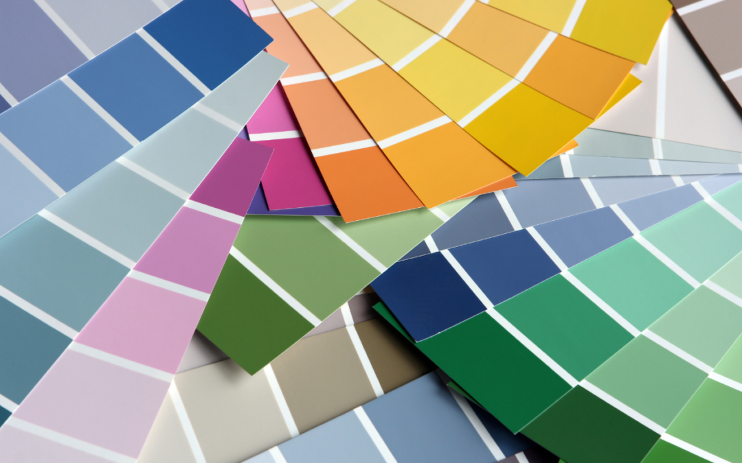
Have you ever walked into a store and felt instantly happy? Or maybe you walked into an office and felt ready to work hard. The colors on the walls have a big power over how we feel. If you own a business, the colors you choose for your building matter a lot.
At JT Paint & Design, we know that commercial painting is more than just making walls look fresh. It is about building your brand. It is about making your workers feel good. And it is about making your customers want to come back.
In this guide, we will talk about how to choose the right colors for your commercial property. We will look at how colors change moods, how they match your brand, and how to pick the best paint for the inside and outside of your building.
Why Do Paint Colors Matter So Much?
You might think that any clean paint will do the job. But colors do much more than cover up old walls. They send a message. When people see your building, the color is the first thing they notice.
Studies show that color can boost brand recognition by up to 80%. This means that if you pick the right colors, people will remember your business better. Think about famous fast-food places. You know them by their bright red and yellow signs. You know big banks by their strong blue logos.
The colors you pick for your commercial painting project will help tell your story. They show if you are fun, serious, calm, or exciting.
Colors Change How We Feel
Color psychology is the study of how colors affect our moods and actions. Different colors make our brains react in different ways. Here is a look at what common colors mean:
• Blue: Blue is a very popular color for businesses. It makes people feel calm and safe. It shows trust and power. Many banks and offices use blue because it helps workers focus and stay productive.
• Green: Green reminds us of nature. It is peaceful and easy on the eyes. It is a great choice for doctors’ offices or spas because it helps people relax. It also stands for growth and health.
• Yellow: Yellow is bright and happy. It brings energy and warmth. It is good for places where you want people to feel cheerful, like a fun store or a creative office. But be careful, too much bright yellow can make people feel anxious.
• Red: Red is bold and exciting. It grabs attention right away. It can even make people feel hungry or want to act fast! That is why you see red in many restaurants and on sale signs.
• White: White looks clean and simple. It makes small spaces look bigger and brighter. But, if a room is only white, it can feel cold and boring. It is best to mix white with other colors.
• Black: Black is strong and elegant. It looks very professional. However, too much black can make a room feel dark and small. It is often used for small details or trim to make other colors pop.
Matching Paint to Your Brand
Your brand is the personality of your business. When you plan a commercial painting job, you must think about your brand identity.
Do you already have a logo? Look at the colors in your logo. You should use those colors, or colors that look good with them, on your building. This makes everything look connected.
For example, if your logo is navy blue and silver, you might paint your walls a light gray and use navy blue for the doors and trim. This gives a neat and professional look.
If your business is a fun toy store with a bright orange logo, you might want a bright and happy wall color to match the playful mood.
The Rule of Three
A good rule for picking colors is to use three colors.
1. The Main Color:
This color will cover most of your walls. It should be a color that is easy to look at, like a soft gray, beige, or light blue.
2. The Secondary Color:
This color is used less than the main color. It can go on one wall (an accent wall) or on big pieces of furniture.
3. The Accent Color:
This is a bright or bold color. You use it in small amounts. It can go on doors, window frames, or small decorations. This is a great place to use your main brand color.
Choosing Colors for the Inside of Your Building
The inside of your building is where the action happens. It is where your workers spend their day. It is where your customers shop or get help. The colors you choose here need to work well for both groups.
Colors for Your Workers
If you have an office, you want your workers to do a good job. The right commercial painting choices can help them!
As we learned, blue is great for focus. If your workers need to look at computers all day, a soft blue wall can help them stay calm and work hard. Green is also very good for offices because it does not tire the eyes.
If your workers need to be creative and think of new ideas, try adding some yellow or orange. These colors give energy and spark creativity.
Colors for Your Customers
Think about how you want your customers to feel when they walk in.
If you run a high-end store, you might want colors that look rich and fancy, like deep purple, dark gray, or even black accents.
If you run a gym, you want people to feel active and ready to move. Bright colors like red, orange, or neon green can give them that extra push.
If you run a waiting room for a dentist, you want people to feel calm and not scared. Soft blues, greens, and warm beiges are perfect for this.
What is an Accent Wall?
An accent wall is one wall in a room that is painted a different color than the other walls. This is a very popular trend in commercial painting right now.
An accent wall is a great way to add a bold color without making the whole room feel too crazy. You can paint the wall behind your front desk a bright, fun color. This draws the eye and shows people exactly where to go when they walk in.
Choosing Colors for the Outside of Your Building
The outside of your building is your first chance to make a good impression. If the paint is peeling or the colors look bad, people might not want to come inside.
When picking exterior paint colors, you have to think about a few extra things.
Look at the Neighborhood
Take a walk around your building. What do the other buildings look like? You want your business to stand out, but you do not want it to look completely out of place.
If all the buildings on your street are historic and made of red brick, painting your building bright neon pink might not be a good idea. You might upset your neighbors or break local rules. Instead, you could pick a nice cream color with dark green trim. This looks classy and fits in well.
Think About the Weather
The sun and weather can change how paint looks over time. If your building gets a lot of hot sun, dark colors will absorb the heat and make the building hotter inside. Dark colors can also fade faster in the bright sun.
Lighter colors, like white, tan, or light gray, reflect the sun. This can help keep your building cooler and the paint will look fresh for a longer time.
Trends in Exterior Commercial Painting
Right now, neutral colors are very popular for the outside of commercial buildings. Colors like “greige” (a mix of gray and beige), soft charcoal, and earthy taupe are top choices for 2026.
These colors look modern and clean. They also make a great background for your business signs. If your building is a soft gray, a bright red or blue sign will really stand out and be easy to read.
Lighting Changes Everything
Here is a very important tip: Color looks different under different lights!
The color you pick in a store under bright lights might look completely different on your office wall.
Natural sunlight changes throughout the day. A color might look warm and yellow in the morning sun, but look cool and blue in the afternoon shade.
Inside lights also change colors. LED lights can make colors look sharp and bright. Fluorescent lights can make colors look a little green or harsh.
Before you start a big commercial painting job, always test the colors. Get small samples of the paint. Paint a small square on a few different walls. Look at the squares in the morning, in the afternoon, and at night with the lights on. Make sure you love the color in every kind of light.
Picking the Right Type of Paint
Choosing the color is only half the battle. You also need to choose the right type of paint. Commercial buildings get a lot of use. People touch the walls, bump into them with carts, and track in dirt. You need paint that is tough.
Paint Finishes
The “finish” of the paint means how shiny it is.
• Flat or Matte: This paint has no shine. It is great for hiding bumps or cracks on the wall. But, it is very hard to clean. It is best for ceilings or walls that people do not touch.
• Eggshell or Satin: This paint has a little bit of shine. It is easier to clean than flat paint. It is a good choice for most office walls or waiting rooms.
• Semi-Gloss or Gloss: This paint is very shiny. It is very tough and very easy to clean. You can wipe dirt right off. It is perfect for doors, trim, bathrooms, and kitchens.
VOCs
VOCs stand for Volatile Organic Compounds. These are chemicals in some paints that smell bad and can be harmful to breathe.
When you paint a commercial building, you do not want your workers or customers to get sick from the paint smell. Ask your commercial painting contractor to use “Low-VOC” or “Zero-VOC” paints. These paints are much safer and do not leave a strong smell behind.
Why You Need a Professional Commercial Painting Team
Painting a big commercial building is not a DIY job. It takes a lot of time, special tools, and expert skills.
Here is why you should hire a professional team like JT Paint & Design for your commercial painting needs:
1. We Save You Time:
You have a business to run. You cannot stop working to paint walls. A professional team works fast. We can even work at night or on weekends, so we do not bother your customers or workers.
2. We Do the Prep Work:
The secret to a great paint job is the prep work. We clean the walls, fix cracks, and sand rough spots before we open a single can of paint. This makes the final color look smooth and perfect.
3. We Have the Right Tools:
Commercial buildings have high ceilings, big walls, and tricky corners. We have the ladders, scaffolding, and sprayers needed to reach every spot safely.
4. We Give Expert Advice:
If you are still not sure what colors to pick, we can help! We have painted many businesses. We know what colors look best and what types of paint will last the longest.
5. We Clean Up:
When the job is done, we do not leave a mess. We take away all the trash, drop cloths, and tape. Your business will be ready to open looking better than ever.
Make Your Business Shine with JT Paint & Design
Choosing the right colors for your commercial property is a big decision. The colors you pick will represent your brand, affect your workers’ moods, and welcome your customers.
Take your time. Think about color psychology. Look at your logo. Test the colors in different lights. And remember, you do not have to do it alone!
If you are ready to give your business a fresh, new look, JT Paint & Design is here to help. We are experts in commercial painting. We will work with you to find the perfect colors and deliver a flawless paint job that will make your business shine for years to come.
Contact us today to start planning your next big project!