
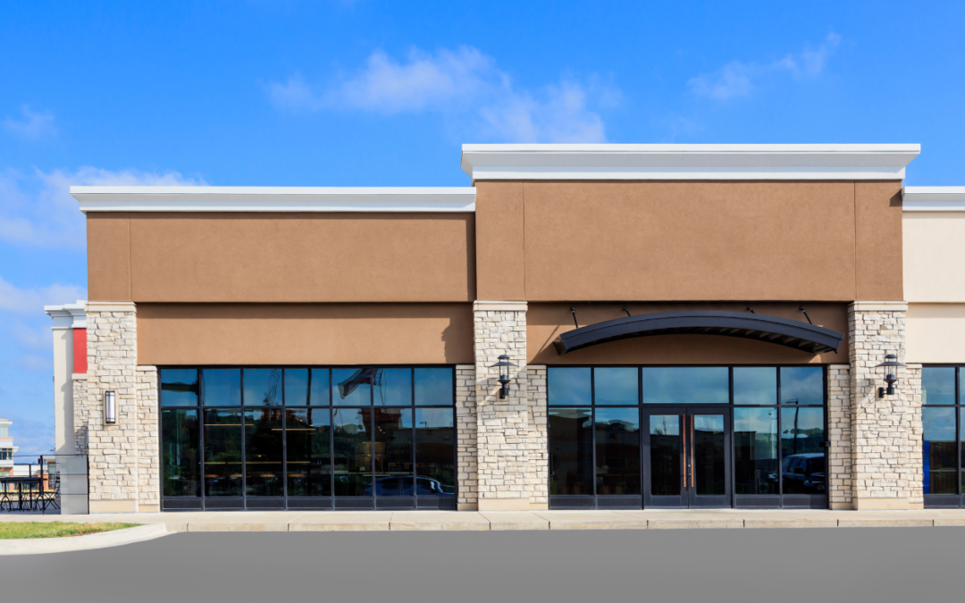
Choosing paint colors for a business can feel like a big job. The color on your walls, doors, trim, and outside surfaces does more than make the building look fresh. It helps people form an opinion before they speak to your team, buy a product, or walk through the door.
The right colors can make a lobby feel calm, a store feel easy to shop, or an office feel clean and focused. The wrong colors can make a room feel dark, busy, dated, or hard to use. That is why a smart commercial painting plan starts with more than a favorite color chip.
At JT Paint & Design, we help property owners and managers make color choices that work in real spaces. A strong plan should support your brand, fit the people using the building, and hold up to daily wear. It should also look good in the light you actually have—not just under the bright lights of a paint store.
This guide walks through a simple process for choosing colors for your commercial property. Use it before you pick a final palette or schedule your next painting project.
Start With the Job Your Space Needs to Do
Before looking at paint samples, think about how people use the property. A color that works well in a quiet office may not work well in a busy restaurant. A medical office has different needs than a warehouse. The best color plan starts with a clear goal.
Ask a few simple questions. Who visits the space? What do you want them to feel? How long do they stay? What work happens there? What parts of the property get the most traffic?
For example, a law office may want colors that feel steady and professional. Soft blue, warm gray, and deep navy accents can help create that feeling. A child care center may need brighter colors that feel cheerful, but the main walls can still stay calm enough for learning. A retail store may use a bold brand color near the entrance or checkout area to draw the eye.
Think about the space in zones. Each zone can have a different purpose, even if the full property uses one connected color plan.
|
Area of the property
|
Main goal
|
Color approach
|
|
Entry and reception
|
Make a strong first impression
|
Use clean neutrals with a brand-color accent
|
|
Hallways and stairs
|
Help people move safely
|
Choose light, durable colors with clear contrast
|
|
Offices and meeting rooms
|
Support focus and comfort
|
Use calm colors with limited bold accents
|
|
Break rooms
|
Give people a mental break
|
Add warm or lively colors without making the room loud
|
|
Retail or display areas
|
Guide attention to products
|
Keep major surfaces simple and use accents with purpose
|
|
Exterior
|
Build recognition from the street
|
Use colors that fit the brand, building material, and setting
|
This does not mean every room needs a different color. Too many colors can make a property feel scattered. Instead, use a small group of colors in a clear way. One main wall color, one trim color, and one or two accent colors are often enough.
Let Your Brand Lead, but Do Not Let It Take Over
Your brand colors matter. They help customers recognize your business. If your logo uses blue and gold, people may expect to see some form of those colors when they enter your property. Using brand colors in your commercial painting plan can make your building and marketing feel connected.
Still, you do not need to paint every wall in the brightest color in your logo. Strong colors are useful, but they need the right place. A bright red may work well behind a reception desk, on a feature wall, or on a sign. Covering every wall in red could make the room feel smaller and tiring over time.
Start by sorting your brand colors into three groups. First, choose a main background color. This is usually a neutral color that covers most of the walls. Next, choose a support color. This may appear on a smaller wall, in a meeting room, or on trim. Last, choose an accent color. This is the color that catches attention in key spots.
If your company has a bold logo but you want a quiet workplace, use the bold logo color in smaller areas. You can use it on a front desk wall, a door, a stripe, a display wall, or painted furniture. This keeps the brand visible without turning the whole building into an ad.
It also helps to look at your existing materials. Floor tile, carpet, counters, woodwork, brick, stone, and window frames all have color. Paint should work with those items. Replacing flooring can be costly. Changing paint is usually easier, so let the fixed materials guide the palette.
Choose Colors for the Feeling You Want to Create
Color can affect how a room feels. This is not magic, and every person reacts in a different way. But color can help set the mood of a space. When you choose color with purpose, you give people helpful visual clues about the type of place they have entered.
Blues often feel calm, steady, and clean. They can work well in offices, health care spaces, financial businesses, and waiting rooms. Softer blues can make a room feel open. Darker blues can add a formal, trusted look when used on an accent wall or trim.
Greens can feel balanced and natural. They often work well in wellness spaces, professional offices, outdoor-related businesses, and break rooms. Sage and olive tones can feel warm and mature. Brighter greens can feel active, but use them in smaller amounts so they do not take over the room.
Warm colors such as soft yellow, terracotta, and warm beige can make a space feel welcoming. These colors can work in restaurants, cafes, waiting rooms, and hospitality spaces. Very bright yellow or orange can feel energetic, but it may also feel harsh under strong lighting. Test it before you commit.
Red is a high-energy color. It can help draw attention, which makes it useful for branded details, dining spaces, or places where you want a quick visual signal. It is often better as an accent than as the main color for a full room.
Neutrals are not boring when chosen well. White, cream, gray, taupe, and beige can give your property a clean base. They make it easier to update signs, furniture, and accent colors later. A neutral base can also make a small space feel less crowded. The key is to choose a neutral with the right undertone. Some grays lean blue. Some creams lean yellow. Some beige colors lean pink or green. Those small shifts can change the full look of the room.
Look at Light Before You Pick a Final Color
Light changes paint. A color that looks soft and warm in a showroom may look cool and gray in your office. A bold color can look dull in a dark hallway or much brighter near large windows. This is why small paper chips are not enough for a final choice.
Start with natural light. Notice which rooms have morning sun, afternoon sun, or very little sun. A wall that gets direct afternoon light may show warm colors more strongly. A room with little daylight may need lighter paint to avoid feeling closed in.
Then look at your indoor lighting. Many properties have a mix of light sources. You may have ceiling lights, task lights, display lights, and daylight all hitting the same wall. Some bulbs make colors look warmer. Others make them look cooler. A paint color should be tested under the lighting your staff and customers use each day.
Buy sample paint and test large sections on the real wall. Paint at least two samples on different sides of the room. Look at them in the morning, afternoon, and evening. Stand near the door, at the desk, and across the room. If you can, place a sample next to flooring, furniture, and signage.
Do not pick a color only because it looks good on one wall. Ask how it looks beside the ceiling, trim, floors, and neighboring rooms. A color should work as part of the full property, not as a single square on a wall.
Use Contrast to Make the Property Easier to Navigate
A beautiful property should also be easy to use. Clear contrast helps people see doors, signs, stairs, handrails, and key features. This matters for customers, visitors, and employees. It is especially helpful for people with low vision.
Contrast means a clear difference between two surfaces. A dark door against a light wall is easier to notice than a gray door against a similar gray wall. Dark lettering on a light sign, or light lettering on a dark sign, is easier to read than low-contrast lettering. The U.S. Access Board notes that higher contrast improves legibility for people with low vision and that textured backgrounds can reduce readability.
Use contrast with care in busy areas. In a hallway, choose a wall color that helps doors stand out. At stairs, use colors and materials that help people see the change in level. At restrooms, meeting rooms, and exits, make sure signs are easy to spot and read. Avoid glossy paint behind important signs because glare can make words harder to see.
Contrast does not mean every surface must be black and white. You can create a clear difference with navy and pale gray, forest green and cream, charcoal and white, or other pairs that have a visible change in lightness. A painting professional can help you review samples in the real space.
Plan for Wear, Cleaning, and Touch-Ups
Commercial properties get used. Hands touch doors and walls. Carts bump corners. Chairs rub against paint. Food, dust, rain, and cleaning products all leave marks. A good color choice should also be a practical choice.
Very light walls can show dirt in a busy entry or loading area. Very dark walls can show dust, scuffs, and fingerprints. Mid-tone colors often hide everyday marks better. They can be a smart choice for hallways, stairwells, work areas, and other high-traffic spaces.
Think about paint sheen, too. Sheen is how much a painted surface reflects light. Flat paint has very little shine. It can hide small wall flaws, but it may be harder to clean. Eggshell and satin finishes have a soft sheen and often work well on many commercial walls. Semi-gloss and gloss are easier to wipe down, so they can work well on doors, trim, and areas that need regular cleaning. However, higher sheen can show dents and wall flaws more clearly.
Ask your painter about the best finish for each area. The right answer may change from room to room. A calm waiting room may need a different finish than a busy break room or an exterior door.
Save the exact paint name, brand, sheen, and color code when the project is complete. Keep a small amount of labeled touch-up paint if the product instructions allow it. This makes future repairs faster and helps your building keep a consistent look.
Think About the Outside of Your Building
Exterior color is a major part of your first impression. People see your building before they see your staff, your products, or your service. The exterior should be clear, well cared for, and easy to recognize from the street.
Start with the parts you cannot easily change. Brick, stone, roofing, metal panels, sidewalks, and nearby buildings all affect what paint colors will look right. A color that fits a modern metal building may not fit a historic brick storefront. Your city, landlord, property association, or brand guide may also limit your choices, so check those rules early.
Most commercial exteriors work best with a simple system: one field color for the large wall areas, one trim color, and a small accent color for doors, signs, or special details. This keeps the property from looking busy at a distance.
Think about sun and weather. Dark colors can fade more visibly over time, especially on surfaces with strong sun. Some dark colors may also make heat more noticeable on certain exterior surfaces. Your painting professional can help match the coating type and color to the material and exposure of the building.
Do not forget your sign. The colors of the building should help the sign stand out, not hide it. Stand across the street or parking lot and look at the full picture. Can a new visitor tell where to enter? Can they see the business name? Does the front door look welcoming?
Avoid These Common Color Mistakes
Many color problems are easy to avoid when you plan ahead. One common mistake is choosing from a tiny sample only. Always test larger samples in your own light. Another mistake is following a trend without thinking about how long it will last. Trend colors can be fun, but repainting a large commercial property is a big commitment. Use strong trends in smaller accent areas if you are not sure.
A third mistake is using too many colors. A busy palette can make a property feel less organized. Choose a few colors and repeat them with purpose. Another mistake is ignoring fixed materials. A wall color can look wrong next to an existing carpet or tile, even if it looked great in a photo.
Some owners choose paint color before they plan the signs, furniture, or lighting. That can create a mismatch later. Whenever possible, make these choices as one plan. You do not need every detail selected before painting, but you should know the overall direction.
Finally, do not choose color without thinking about upkeep. A beautiful wall that looks worn after a few months does not serve your business well. Match the color and finish to the traffic level of each space.
A Simple Commercial Painting Color Process
You can make the decision easier by following a clear process. First, list the goals for the property. Write down the feeling you want, the people who use the space, and the rooms that need special attention. Next, gather your brand guide, logo colors, flooring samples, and photos of the space.
Then create two or three small color directions. Each direction should include a main wall color, a trim color, and one or two accents. Do not start with ten options. A short list makes it easier to compare choices.
After that, paint samples in the actual space. View them at different times of day and under your regular lights. Ask a few trusted people for feedback, but keep the final choice tied to your business goals. The most popular sample is not always the best one for the room.
Before work starts, confirm where each color will go. A simple color schedule can list rooms, walls, doors, trim, sheen, and color names. This helps avoid confusion and gives your painting team a clear plan. It also creates a useful record for future touch-ups.
Work With a Commercial Painting Team That Plans With You
Color selection does not have to feel overwhelming. A skilled commercial painting team can help you move from a broad idea to a plan that works on the wall. The right partner will ask about your brand, traffic, lighting, building materials, schedule, and long-term upkeep before the first coat goes on.
JT Paint & Design can help you make confident color choices for your commercial property. We can help you test samples, build a balanced palette, choose practical finishes, and plan a painted space that supports your business. Whether you are refreshing one office, updating a retail space, or repainting a full exterior, the right color plan helps your property look ready for the people who depend on it.
A smart commercial painting project does more than cover old paint. It gives your business a cleaner, clearer, and more welcoming place to work and visit. Start with the way your space needs to feel, test colors in real light, and choose a simple palette that can stand up to daily use. Those steps can help your property make a strong impression for years to come.